Brand Style Guide
DwarSeva Design System & Components
Logo
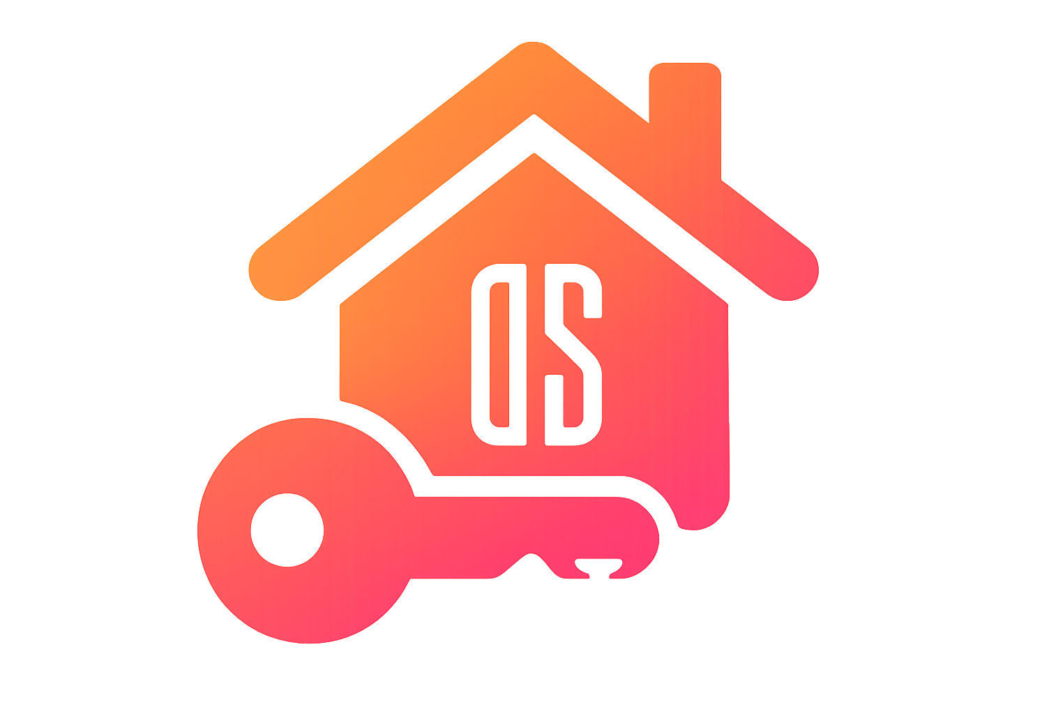
Primary Logo
House with key motif, "DS" letters in white outline
Gradient: Orange (#FF8C00) to Fuchsia (#FF0080)
Color Palette
Primary Colors (Orange)
50
#FFF7ED
100
#FFEDD5
200
#FED7AA
300
#FDBA74
400
#FB923C
500
#F97316
600
#EA580C
700
#C2410C
800
#9A3412
900
#7C2D12
Secondary Colors (Fuchsia)
50
#FDF4FF
100
#FAE8FF
200
#F5D0FE
300
#F0ABFC
400
#E879F9
500
#D946EF
600
#C026D3
700
#A21CAF
800
#86198F
900
#701A75
Logo Gradient Colors (Exact)
Top (Roof)
#FF8C00
Middle (House)
#FF6464
Bottom (Key/Base)
#FF0080
Feedback Colors
Success
#10B981
Warning
#F59E0B
Danger
#EF4444
Info
#3B82F6
Typography
Font Family
Geist Sans Bold (H1)
Geist Sans Semibold (H2)
Geist Sans Medium (H3)
Geist Sans Regular (Body)
Geist Sans Small
Geist Sans Caption
Type Scale
H1: 36/44, ExtraBold
Used for main page titles and hero sections
H2: 30/40, Bold
Used for section headings
H3: 24/32, Semibold
Used for subsection headings
H4: 20/28, Semibold
Used for card titles and small headings
Body: 16/24, Regular
Used for main content and paragraphs
Small: 14/20, Regular
Used for secondary text and captions
Caption: 12/16, Regular
Used for metadata and fine print
Component Examples
Buttons
Cards
Card Title
This is a sample card with the standard styling.
Primary Card
Card with primary color background.
Secondary Card
Card with secondary color background.
Form Elements
Spacing & Layout
Container Padding
Standard container padding: p-4
Section Gaps
Section gap: gap-4
Section gap: gap-3